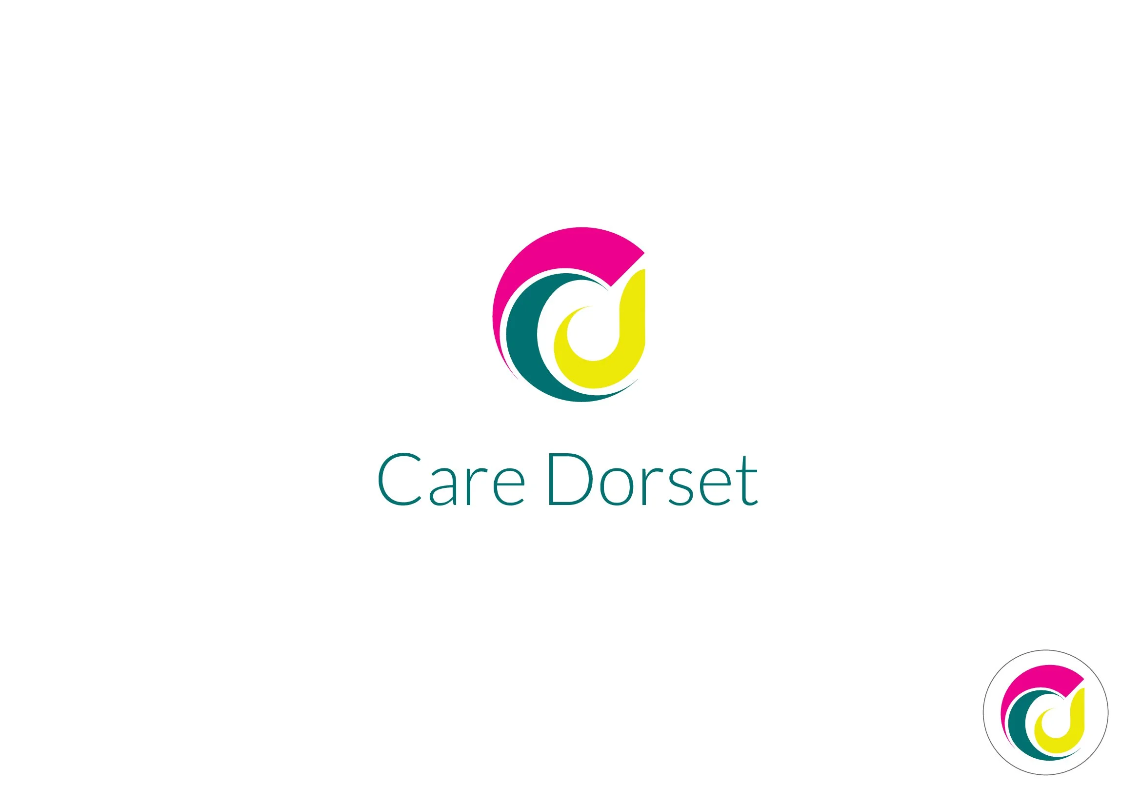
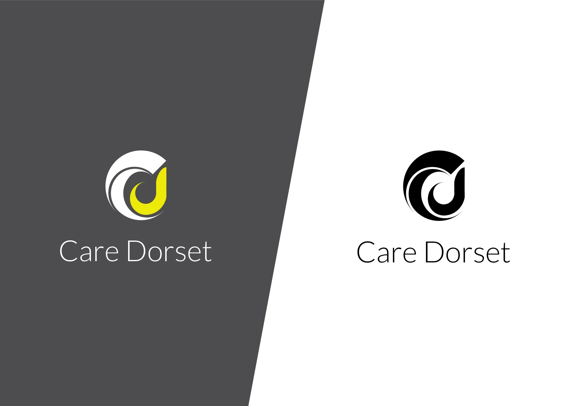
Care Dorset
Care Dorset was a proposed visual identity project for a new council-funded care service in Dorset. Working to a client brief, I developed one of three potential brand directions, exploring how different visual styles could influence perceptions of the service.
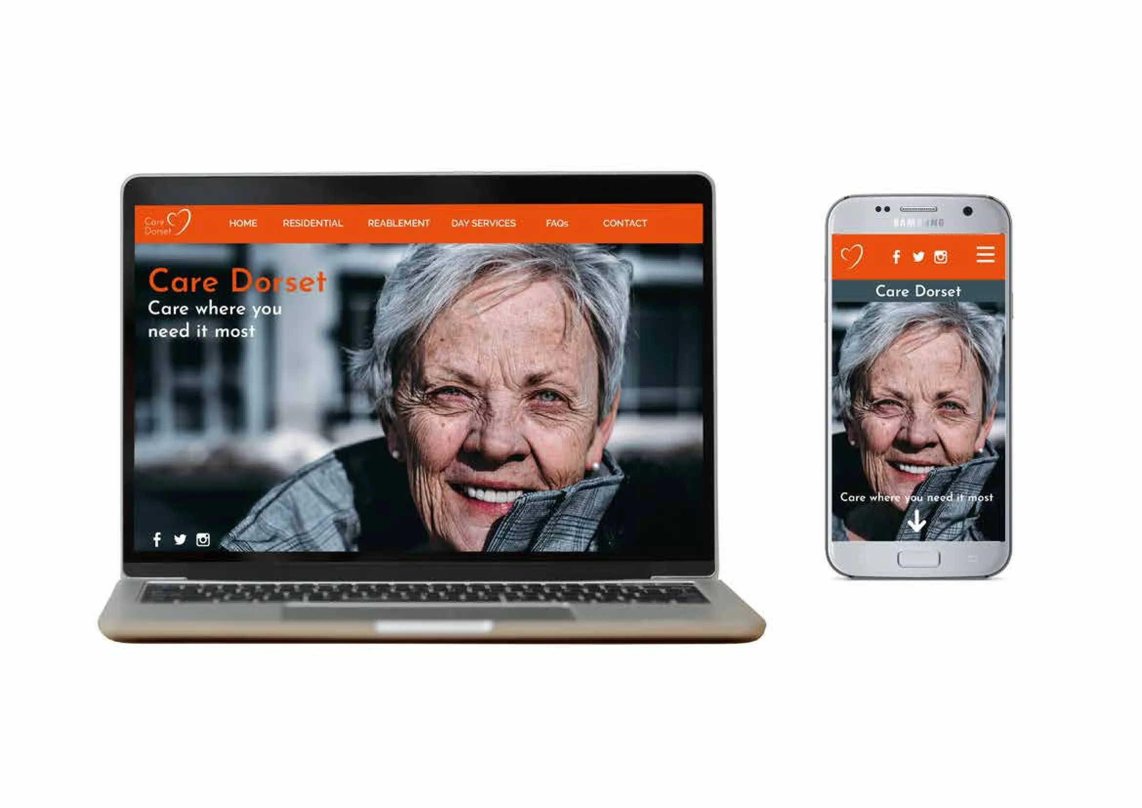
The project went beyond logo design, focusing on how the identity could be applied consistently across websites, mobile layouts, photography, typography and wider brand materials. Each concept aimed to balance trust and accessibility while demonstrating how the brand could reach across different digital platforms and audience touchpoints.
Concept 1:
Minimal, Premium and Human
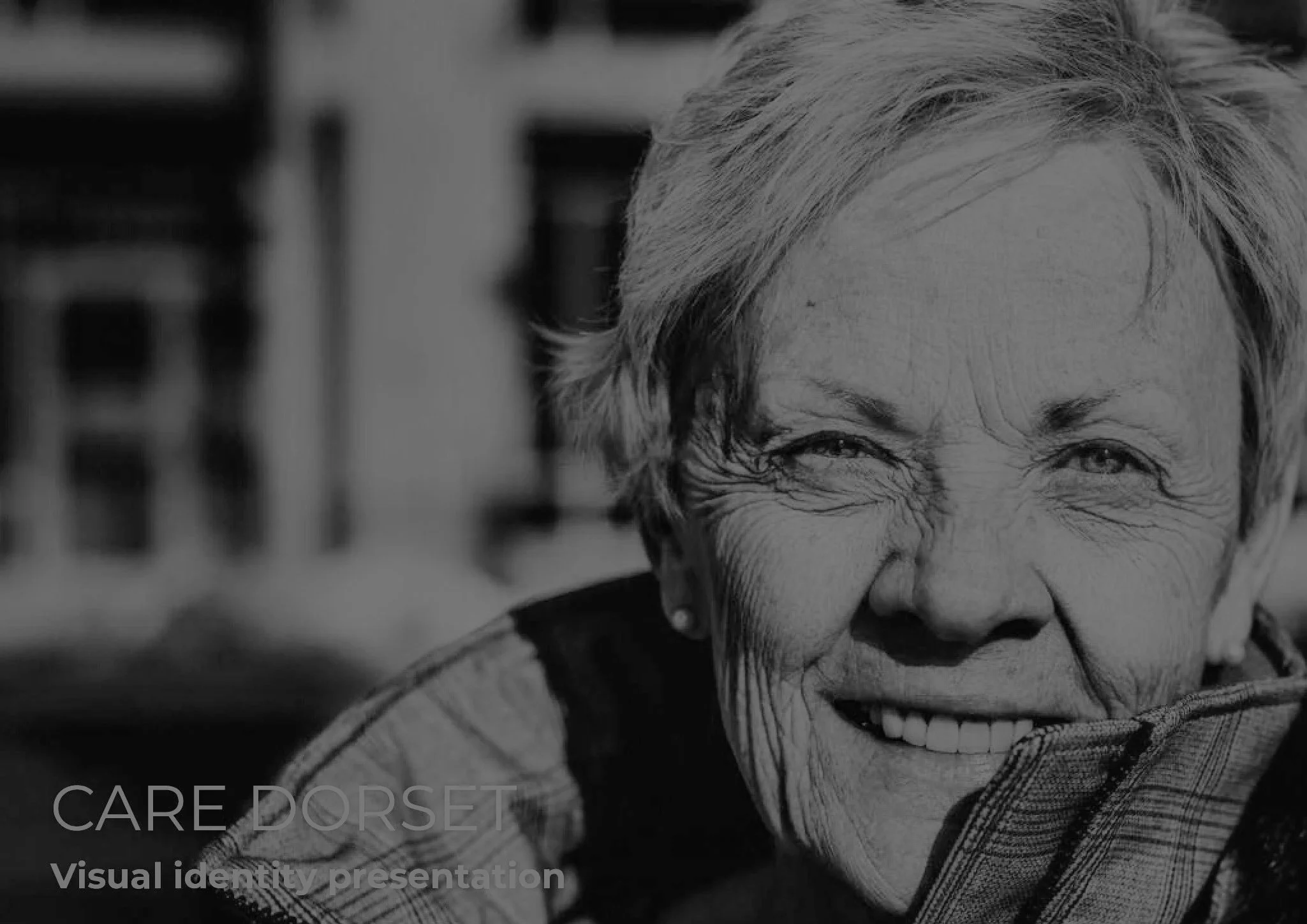
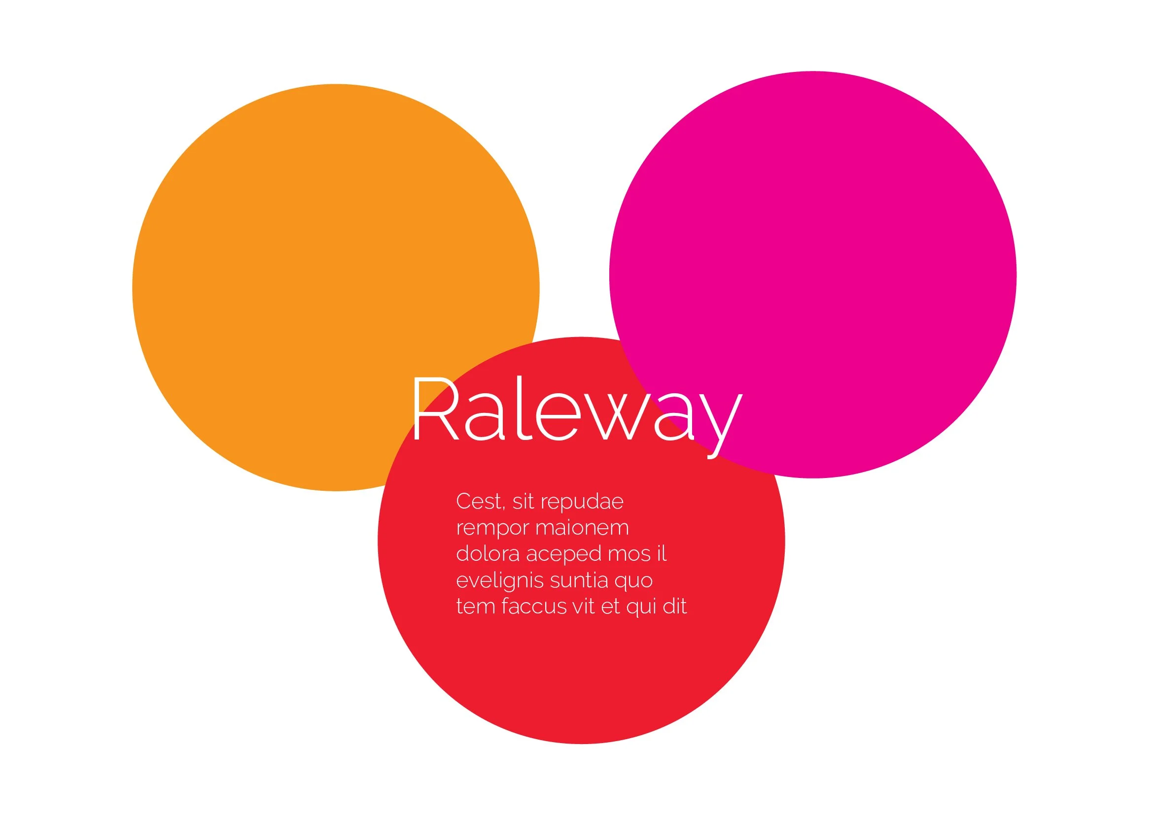
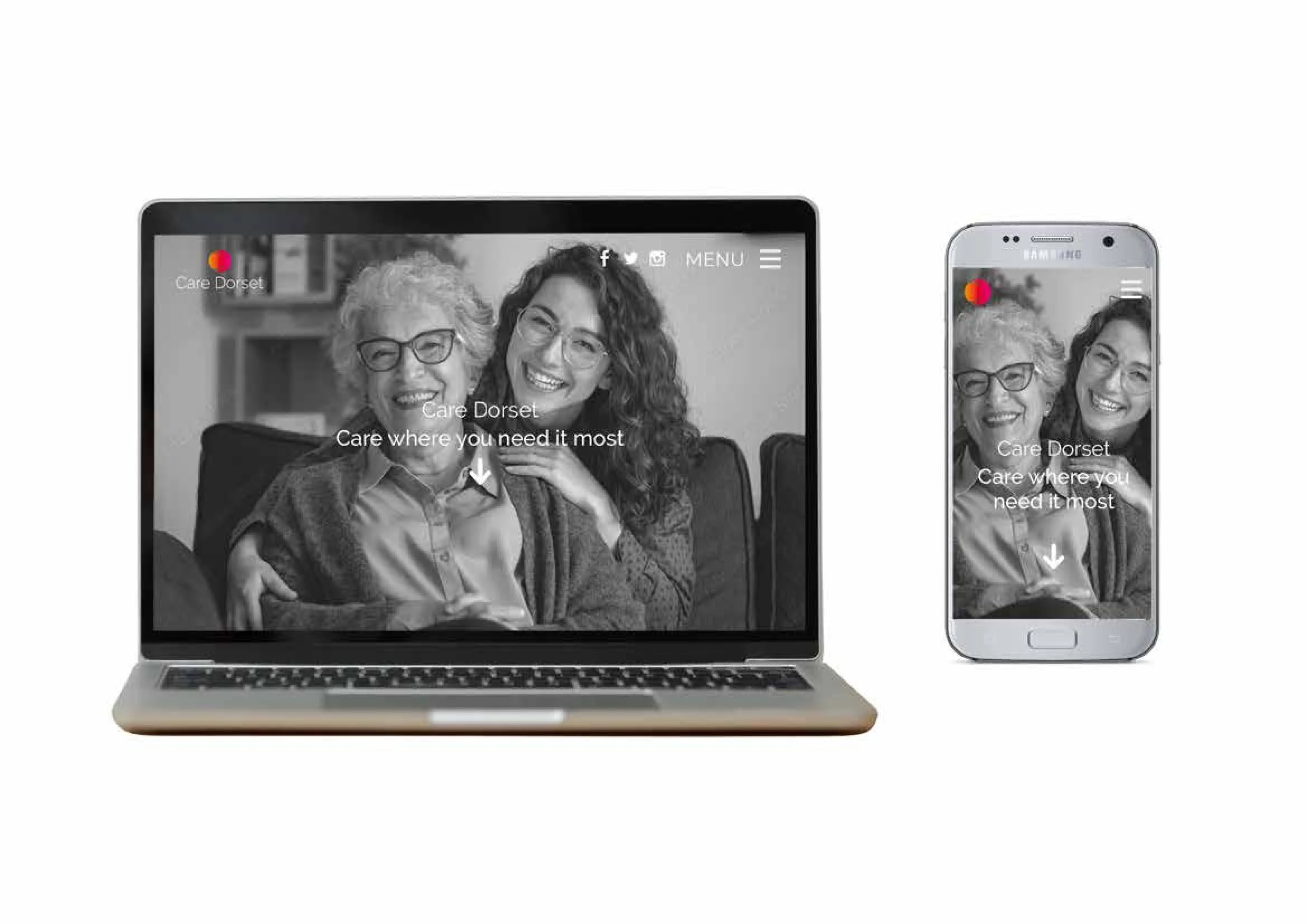
The first concept is the most emotionally-led. It uses a dark photographic style, lots of white space and the clean, elegant feel of the Raleway typeface. The logo itself is very simple, with a subtle symbol that feels less “clinical” and more personal. The monochrome imagery also gives the brand a more serious, premium tone.
this route positions Care Dorset as calm, compassionate and trustworthy. Rather than looking like a traditional council service, it feels more like a modern wellbeing or lifestyle brand. This could appeal particularly well to family members making care decisions, as it presents care as dignified and people-focused rather than institutional.
this route relies heavily on emotional storytelling and photography to create reassurance, with the branding deliberately taking a back seat to the people.
Concept 2:
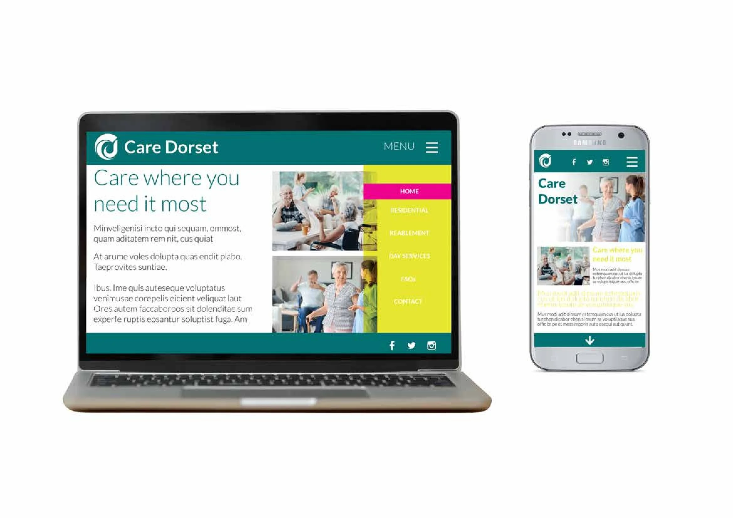
Practical, Accessible and Service-Led
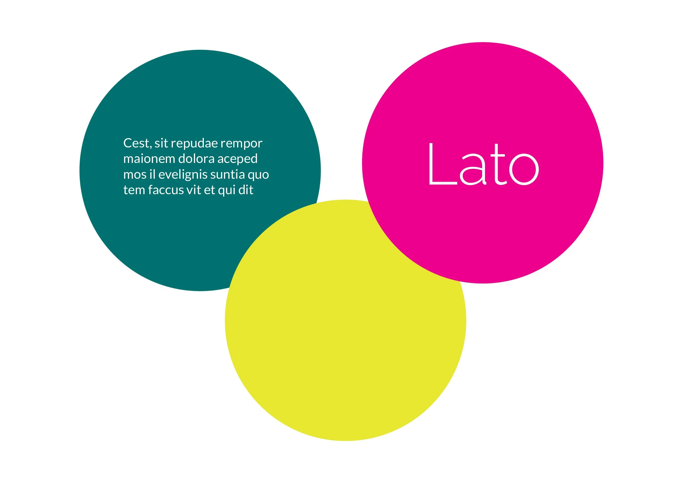
The second concept is much brighter and more functional. It uses a teal and lime palette with blocks of colour to create navigation, alongside the Lato typeface which is clean, readable and widely used in digital interfaces.
This route balances friendliness with clarity. The brighter colours help make information easier to navigate, particularly for older audiences or users who may not be digitally confident. The bold colour coding across the website also suggests different service areas and makes the brand feel practical and easy
to use.
this concept stands as the strongest “public sector” option because it demonstrates accessibility, usability and functionality across digital platforms. It Demonstrates a safe and scalable route for a care organisation with lots of information to communicate.
Concept 3:
Warm, Community-Focused and Approachable
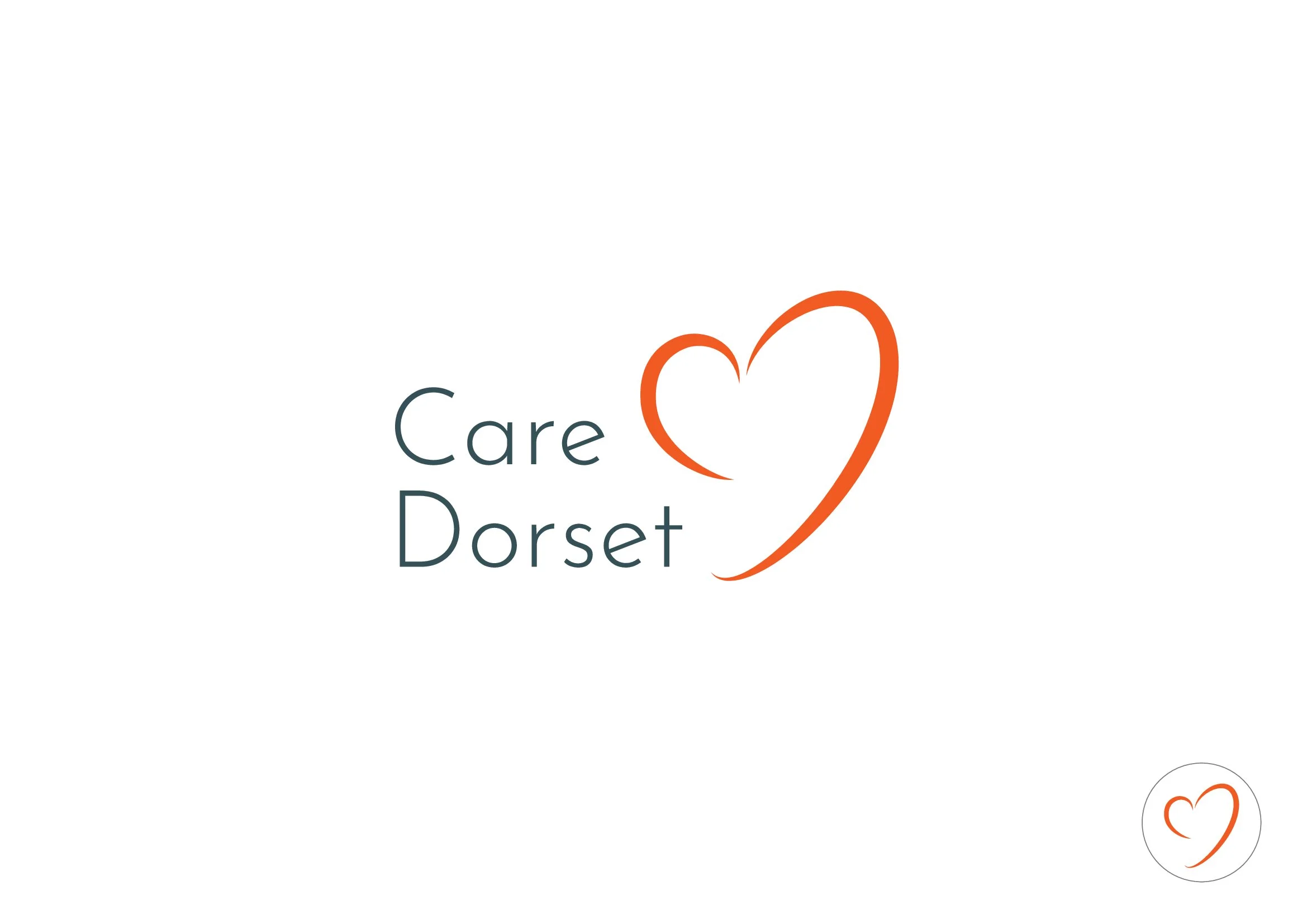
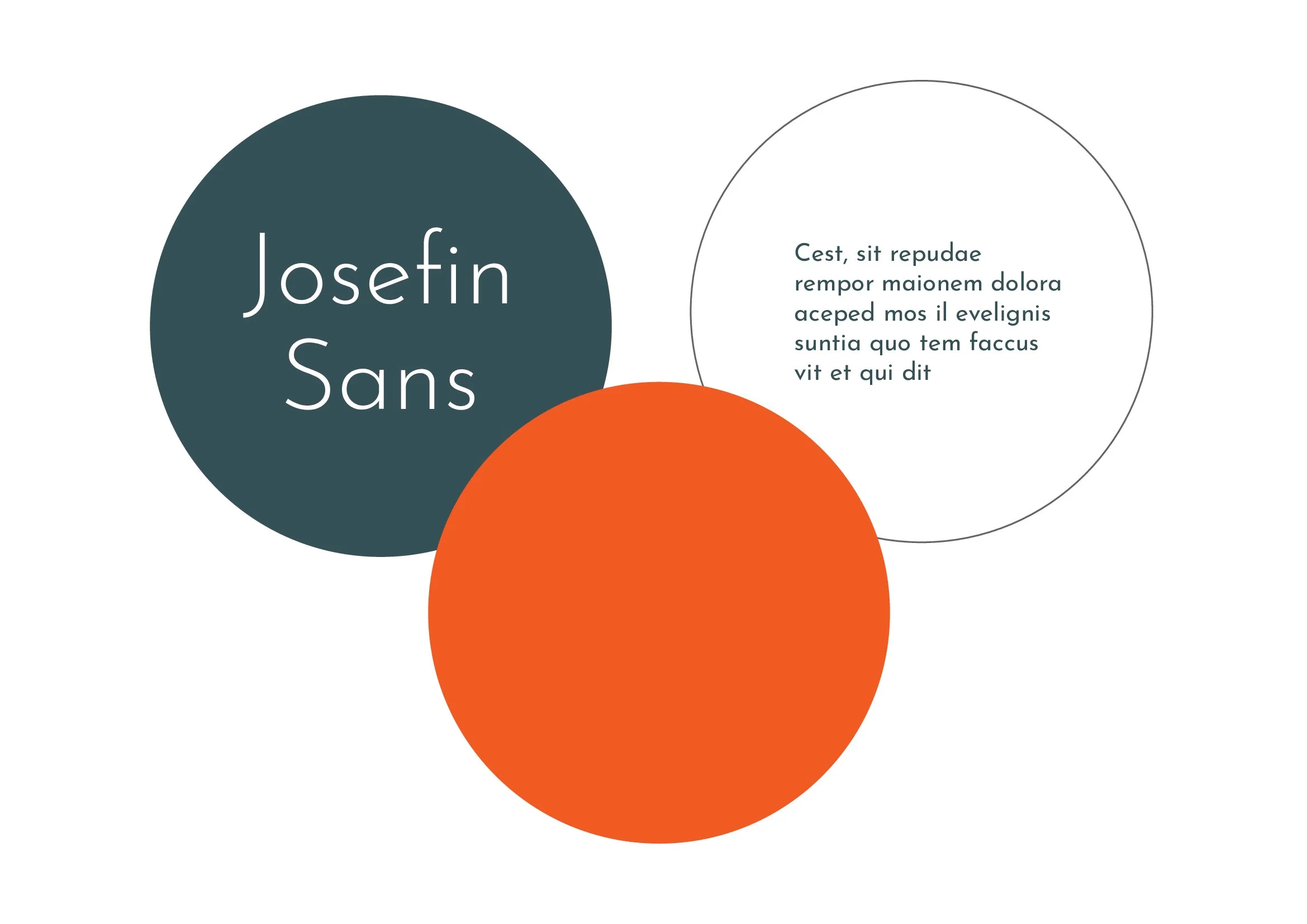
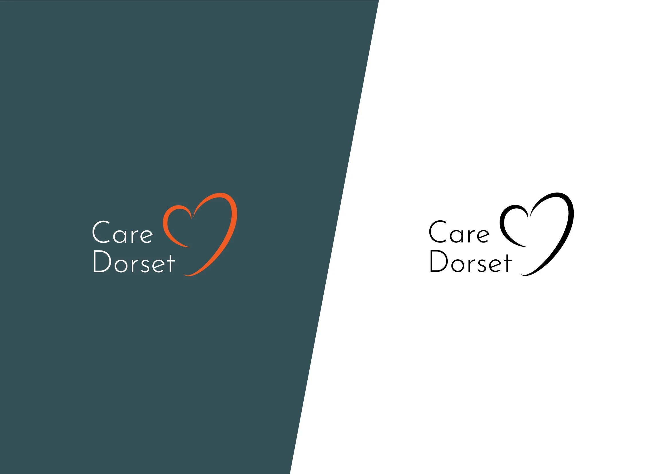
The third concept uses orange tones, softer curves and the Josefin Sans typeface, which gives it a more distinctive personality. The orange header and warmer colour palette make the brand feel more welcoming and energetic.
The rationale here is that this route presents care as positive, active and social rather than purely medical. It feels less like a council service and more like a local support network. The warmth of the photography combined with the brighter colour palette helps reduce the fear or stigma that can sometimes be associated with care services.
this concept was designed to make the service feel less intimidating and more approachable for both service users and their families. It would likely appeal to audiences who value warmth, personality and local connection.